Monthly Summary
What is this tool?
Calculates various monthly statistics
for a station over a range of years chosen by the user
Calculations are based on daily input data
Tables and graphs can be created for the following climate variables:
-
Maximum/Minimum/Mean Temperature, Temperature Range (station only)
Precipitation/Snowfall (station only)/Snow Depth (station only)
Heating/Cooling/Growing Degree Days
-
Monthly Maximum
Monthly Minimum
Monthly Average
Standard Deviation
Number of Days (above/below/between thresholds)
Range during Month
Monthly Sum
What datasets can be used?
Works with historic station data as well as gridded datasets
SEE STATION_NETWORKS
SEE GRIDDED DATASETS
Source: Northeast Regional Climate Center (NRCC)
Domain: Continental US
Temporal Resolution: Daily
Date Range: 1950 - Present
Spatial Resolution: 5 km
Climate Variables: Maximum/Minimum Temperature, Precipitation, Degree Days
NRCC Interpolated High Resolution
Source: Northeast Regional Climate Center (NRCC)
Domain: East of Rockies
Date Range: 2007 - Present
Temporal Resolution: Daily
Spatial Resolution: 5 km
Climate Variables: Maximum/Minimum Temperature, Precipitation, Degree Days
PRISM
Source: PRISM Climate Group
Domain: Continental US
Temporal Resolution:
Daily
Date Range: 1981- Present
Spatial Resolution: 4 km
Climate Variables:
Maximum/Minimum/Average Temperature, Precipitation, Degree Days
Version: “4kmD1”
Temporal Resolution
Daily
All data sets are made available through the ACIS system.
What can you do with this tool?
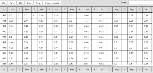
Generate summary tables

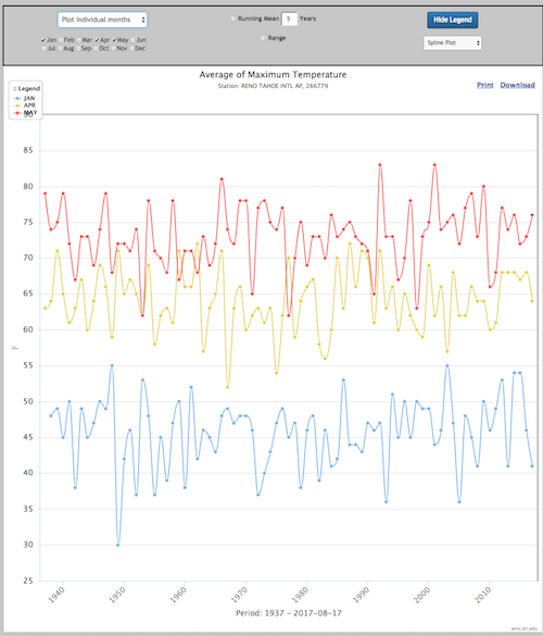
Generate time series graphs for individual months or
summarize several months in one graph

Get raw data behind the graphics
- Station: Search for a single station.
You can enter a station name or ID.
Use the Station Finder to find a station name or ID. - Gridpoint: Search for a single grid point.
Enter a Lon,Lat coordinate or
Use the map interface by dragging the marker to find your location.
See more on gridded datasets
Source: Northeast Regional Climate Center (NRCC)
Domain: Continental US
Temporal Resolution: Daily
Date Range: 1950 - Present
Spatial Resolution: 5 km
Climate Variables: Maximum/Minimum Temperature, Precipitation, Degree Days
NRCC Interpolated High Resolution
Source: Northeast Regional Climate Center (NRCC)
Domain: East of Rockies
Date Range: 2007 - Present
Temporal Resolution: Daily
Spatial Resolution: 5 km
Climate Variables: Maximum/Minimum Temperature, Precipitation, Degree Days
PRISM
Source: PRISM Climate Group
Domain: Continental US
Temporal Resolution:
Daily
Date Range: 1981- Present
Spatial Resolution: 4 km
Climate Variables:
Maximum/Minimum/Average Temperature, Precipitation, Degree Days
Version: “4kmD1”
-------- LOCA DOWNSCALED CMIP5 PROJECTIONS --------
GDFL-CM3
Source: Geophysical Fluid Dynamics Laboratory
Domain: US, Canada, Mexico
Temporal Resolution: Daily
Date Range: 1950 - 2100
Spatial Resolution: 6 km
Climate Variables: Maximum/Minimum Temperature, Precipitation, Degree Days
Emission Scenarios: rcp45, rcp85
HadGEM2-CC
Source: Met Office Hadley Center
Domain: US, Canada, Mexico
Temporal Resolution: Daily
Date Range: 1950 - 2100
Spatial Resolution: 6 km
Climate Variables: Maximum/Minimum Temperature, Precipitation, Degree Days
Emission Scenarios: rcp45, rcp85
HadGEM2-ES
Source: Met Office Hadley Center (additional HadGEM2-ES realizations contributed by Instituto Nacional de Pesquisas Espaciais)
Domain: US, Canada, Mexico
Temporal Resolution: Daily
Date Range: 1950 - 2100
Spatial Resolution: 6 km
Climate Variables: Maximum/Minimum Temperature, Precipitation, Degree Days
Emission Scenarios: rcp45, rcp85
CCSM4
Source: The Community Climate System Model
Domain: US, Canada, Mexico
Temporal Resolution: Daily
Date Range: 1950 - 2100
Spatial Resolution: 6 km
Climate Variables: Maximum/Minimum Temperature, Precipitation, Degree Days
Emission Scenarios: rcp45, rcp85
CanESM2
Source: Canadian Centre for Climate Modelling and Analysis
Domain: US, Canada, Mexico
Temporal Resolution: Daily
Date Range: 1950 - 2100
Spatial Resolution: 6 km
Climate Variables: Maximum/Minimum Temperature, Precipitation, Degree Days
Emission Scenarios: rcp45, rcp85
CESM1-BGC
Source: The Community Earth System Model
Domain: US, Canada, Mexico
Temporal Resolution: Daily
Date Range: 1950 - 2100
Spatial Resolution: 6 km
Climate Variables: Maximum/Minimum Temperature, Precipitation, Degree Days
Emission Scenarios: rcp45, rcp85
CMCC-CMS
Source: The Centro Euro-Mediterraneo sui Cambiamenti Climatici
Domain: US, Canada, Mexico
Temporal Resolution: Daily
Date Range: 1950 - 2100
Spatial Resolution: 6 km
Climate Variables: Maximum/Minimum Temperature, Precipitation, Degree Days
Emission Scenarios: rcp45, rcp85
CNRM-CM5
Source: Centre National de Recherches Météorologiques
Domain: US, Canada, Mexico
Temporal Resolution: Daily
Date Range: 1950 - 2100
Spatial Resolution: 6 km
Climate Variables: Maximum/Minimum Temperature, Precipitation, Degree Days
Emission Scenarios: rcp45, rcp85
MICRO5
Source: Atmosphere and Ocean Research Institute, the University of Tokyo
Domain: US, Canada, Mexico
Temporal Resolution: Daily
Date Range: 1950 - 2100
Spatial Resolution: 6 km
Climate Variables: Maximum/Minimum Temperature, Precipitation, Degree Days
Emission Scenarios: rcp45, rcp85
ACCESS1-0
Source: ARC Centre of Excellence for Climate System Science
Domain: US, Canada, Mexico
Temporal Resolution: Daily
Date Range: 1950 - 2100
Spatial Resolution: 6 km
Climate Variables: Maximum/Minimum Temperature, Precipitation, Degree Days
Emission Scenarios: rcp45, rcp85
-------- NARRCAP PROJECTIONS --------
CRCM -- Canadian Regional Climate Model
Source: Ouranos Climate Simulation Team / UQAM via NARRCAP
Domain: US
Temporal Resolution: Daily
Date Range: 1970 - 2000, 2040 - 2070
Spatial Resolution: 50km
Climate Variables: Maximum/Minimum Temperature, Precipitation
HRM3 -- Hadley Regional Model
Source: Hadley Centre via NARCCAP
Domain: US
Temporal Resolution: Daily
Date Range: 1970 - 2000, 2040 - 2070
Spatial Resolution: 50km
Climate Variables: Maximum/Minimum Temperature, Precipitation
MM5I -- PSU/NCAR mesoscale model
Source: NCAR-Mesoscale Prediction Group/Penn State via NARCCAP
Domain: US
Temporal Resolution: Daily
Date Range: 1970 - 2000, 2040 - 2070
Spatial Resolution: 50km
Climate Variables: Maximum/Minimum Temperature, Precipitation
RCM3 -- Regional Climate Model Version 3
Source: UC Santa Cruz via NARCCAP
Domain: US
Temporal Resolution: Daily
Date Range: 1970 - 2000, 2040 - 2070
Spatial Resolution: 50km
Climate Variables: Maximum/Minimum Temperature, Precipitation
WRFG -- Weather Research Forecasting Model
Source: Mesoscale and Microscale Meteorology spanision of NCAR via NARCCAP
Domain: US
Temporal Resolution: Daily
Date Range: 1970 - 2000, 2040 - 2070
Spatial Resolution: 50km
Climate Variables: Maximum/Minimum Temperature, Precipitation
Time period of the request. Format yyyy.
If you chose any of the Degree Day variables,
please specify your base temperature.
Data can be obtained in metric or English units.
-
Note: degree day calculations are preformed
- English:
Temperatures in Fahrenheit
Precipitation/Snow/Pan Evaporation in Inches
Wind Movements in Miles
-
Metric:
Note: native database units are English.
If you choose metric, be aware that data values loose precision
since they are converted from English units and will be rounded.
Temperatures in Celsius
Precipitation/Snow/Pan Evaporation in Millimiter
Degree Days: °C HDD = (5/9) x (°F HDD)
Wind Movements in Kilometers
with base temperatures in Fahrenheit.
If you choose Heating, Cooling or Growing Degrees as your climate variable,
please choose your base temperature.
Degree Day Calculation
- Heating Degree Days base temperature - (max temperature - min temperature)/2
- Cooling Degree Days (max temperature - min temperature)/2 - base temperature
- Growing degree Days (max temperature - min temperature)/2 - base temperature
- Monthly
Statistic is applied to each month
of each year spanning start and end year. - Weekly
Statistic is applied to each week
of each year spanning start and end year.
- Maximum
Finds maximum
for each period in each year spanning start to end year. - Minimum
Finds minimum
for each period in each year spanning start to end year. - Average
Computes average over non-missing days
for each period in each year spanning start to end year. - Standard Deviation
Computes standard deviation
for each period in each year spanning start to end year.
Uses N-1 degrees of freedom. - Number of Days
Computes number of days that meet user selected threshold criteria
for each period in each year spanning start to end year. - Range
Computes the difference (highest minus lowest daily value)
for each period in each year spanning start to end year. - Sum
Computes sum
for each period in each year spanning start to end year.
Fill out this sub section if your monthly statistic is "Number of Days."
- Less greater or between:
Count the number of days less than/greater than or between threshold(s). - Threshold:
If you choose less than or greater than above, enter your threshold here. - Above/Below:
If you choose between above, enter your lower(Above) and upper(Below) thresholds here.
Months with more than this number of days missing will be omitted from the analysis.
Raw values or Departures from averages rather than raw values.
Missing values
Letters after data values in the columns labeled F (Flag) show number of missing days.
Letters after annual values indicate number of missing months.
(a = 1 day missing, b = 2 days missing, f = 6 days missing, z = 26 or more values missing).
Annual values
On the far right the column "An" summarizes the monthly data for
a particular year.
General statistics for each month summarized over the years defined in
the "Year Range" option.
Example: Variable: Precipitation, Statistic: Sum, Year Range 1937 - 1947
MEAN: Mean of the monthly sums of precipitation values from 1937 to 1947.
SD: Standard Deviation of the monthly sums of precipitation values from 1937 to 1947.
SKEW: Skew of the monthly sums of precipitation values from 1937 to 1947.
MAX: Maximum of the monthly sums of precipitation values from 1937 to 1947.
MIN: Minimum of the monthly sums of precipitation values from 1937 to 1947.
YRS: Number of years used in calculation.
Plotting options in panel above the graph
Pick the months you want to visualize by clicking the checkboxes next to the month names.
You can either plot each month individually or you can summarize the data for the chosen months.
Pick the appropriate option from the dropdown menu above the month names.
Add a running mean by checking the checkbox in the top middle of the panel
and choose the appropriate number of years for your running mean.
The top middle of the panel also contains a checkbox to add the range of the data that is plotted.
The right side of the panel has options to show or hide the legend and to change the chart type.
On the Graph
Hover your mouse over a point on the graph to see the date and data value at that point
Click and drag on the graph to zoom in on a particular area.
A "Reset Zoom" button will pop up on the top righ hand side of the graph. This will allow you to reset the zoom to it's default value.
The legend is movable. Just hover your mouse over the double dots, click and move the legend to the desired position.
In the top right corner of the graph you can find print and serevral download options (PNG, JPEG, PDF, SVG).


